Run Your Site Through the Phone Test Before It Runs Off Customers

Photo: GlacierNPS, Public domain, via Wikimedia Commons
Pull up your website analytics right now — most builders show device breakdowns on the dashboard. There's a good chance you'll see something like 60, 70, maybe 75 percent of your traffic coming from phones.
And yet most people build and edit their websites exclusively on a laptop, judging their site by a version of itself that the majority of their visitors will never see. That gap is where customers quietly disappear.
Google has been mobile-first for years — it indexes the phone version of your site first, which means your mobile experience directly shapes your search visibility. For a local business competing in a US market, that's not a design nicety. It's the front door.
The good news: you can audit your own site in about five minutes. Here's the checklist.
1. The Thumb Test
Open your site on your actual phone and try to do the one thing a customer would come to do — call you, book, or find your address — using only your thumb.
The failure: Buttons so small or so close together that you hit the wrong one. Apple's guidance suggests tap targets around 44 pixels; if you're squinting and aiming, yours are too small.
The fix: In your builder's mobile editor, bump button sizes up and add spacing between tappable elements. Most builders let you adjust mobile layout independently of desktop — use that.
2. The Squint Test
Hold your phone at a normal reading distance. Can you read your headline and body text without zooming?
The failure: Text that looked elegant on a 27-inch monitor is 12 pixels of strain on a 6-inch screen.
The fix: Body text should be at least 16px on mobile. If your template's mobile view feels cramped, increase the base font size in your theme settings — one change, whole site fixed.
3. The Three-Second Rule
Load your site on cellular data, not Wi-Fi. Count to three.
The failure: A hero image that's a 6MB photo straight off someone's DSLR. Mobile visitors bounce in droves when pages crawl, and every extra second of load time compounds it.
The fix: Compress images before uploading (most builders do this automatically, but not all). Avoid autoplaying video backgrounds on mobile — they're data hogs and battery drains.
4. The Popup Escape Hatch
If you run a popup, try closing it with one thumb.
The failure: An X the size of a pinhead in the top corner, or worse, a full-screen popup with no visible close button. On desktop this is annoying. On mobile it's a rage-quit.
The fix: Many builders let you disable popups on mobile entirely — seriously consider it. If you keep one, make the close button generous and the popup small enough that the page is still visible behind it.
5. The Horizontal Scroll Check
Swipe left and right across your homepage.
The failure: Something — usually a wide image, a table, or a pasted embed — is forcing the page sideways. Now every scroll wobbles, and your carefully designed layout looks broken.
The fix: In your builder, check for elements wider than the page container. Oversized images pasted into text blocks are the usual culprit. Resize or remove them.
6. The Above-the-Fold Question
What does a visitor see before scrolling? Genuinely look.
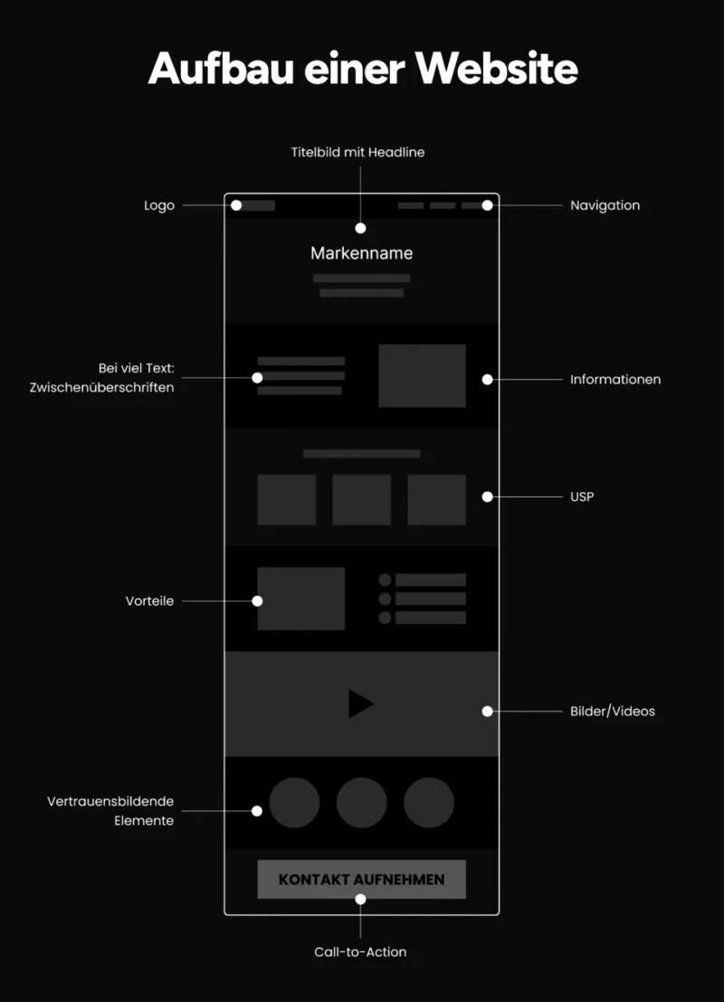
The failure: A giant header, a logo, and a hero image — with no hint of what you do or how to contact you. Mobile screens are small; wasted space is costlier than on desktop.
The fix: Your business name, a one-line description of what you do, and a contact or booking button should all fit in the first phone-screen view.
7. The Form Friction Audit
Open your contact form on your phone and fill it out honestly.
The failure: Eight required fields, a dropdown menu that fights your thumb, and no keyboard optimization for phone numbers or emails.
The fix: Cut the form to name, contact method, and message. Most builders can set the input type so the right keyboard appears — a two-second change that makes forms dramatically less annoying.
8. The Click-to-Call Check
Is your phone number tappable? Is your address linked to maps?
The failure: A phone number displayed as plain text. On mobile, that's a missed call — people won't memorize and redial.
The fix: Most builders have a "phone" or "click-to-call" element. Use it for your number, and link your address to Google Maps. This alone is one of the highest-value fixes a local business can make.
Make It a Habit, Not a One-Off
Here's the underrated perk of DIY builders: you can fix every item on this list yourself, today, without emailing a developer. Run this audit once a quarter and after any major redesign. Your laptop will forgive you — your customers, most of whom are holding a phone right now, will thank you.