Your Website Isn't Closing Sales — And Your Color Scheme Has Nothing to Do With It

Let's be honest: when your website isn't converting visitors into customers, the first instinct is to blame how it looks. Maybe the header image isn't compelling enough. Maybe the brand colors feel off. Maybe you need a new font.
None of that is likely the problem.
The truth is, most conversion issues aren't visual at all. They're structural, behavioral, and copy-based — and the good news is that every single one of them can be fixed without touching a line of code or hiring a designer. All you need is the right checklist and a willingness to look at your site the way a stranger would.
Here's your audit. Go through each section with your site open in another tab.
1. Your Call-to-Action Is Doing Too Much (Or Not Enough)
A call-to-action, or CTA, is the instruction you give visitors about what to do next. "Book a Free Call." "Shop Now." "Get the Guide." Simple, right?
Except most small business websites have one of two problems: either there's no clear CTA at all (the page just kind of... ends), or there are so many competing options that visitors freeze up and leave.
Run this check: Look at your homepage and ask — if a visitor spent 10 seconds here, what one thing would they know to do next? If your answer is "I'm not sure" or "any of several things," you have a CTA problem.
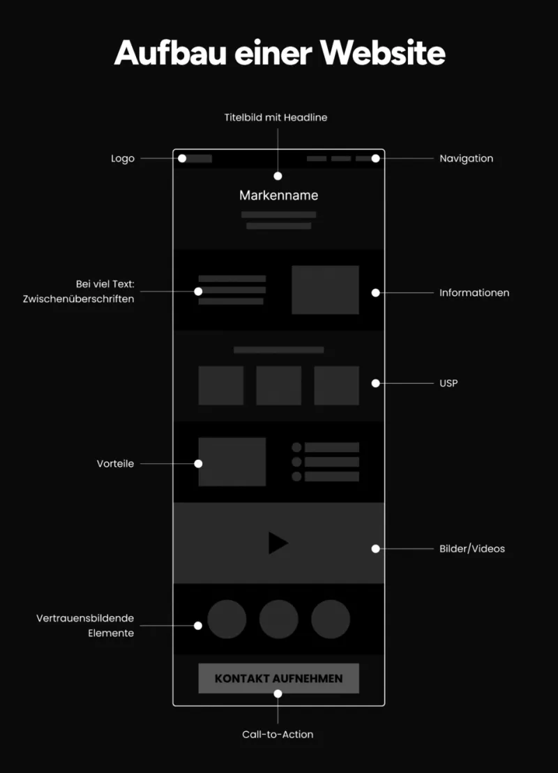
The fix: Pick one primary action per page. Make it specific and outcome-focused. "Start My Free Trial" converts better than "Learn More." "Get My Custom Quote" converts better than "Contact Us." Put that CTA above the fold — meaning visible without scrolling — and repeat it naturally at the bottom of the page.
2. Visitors Don't Trust You Yet — And You're Not Helping Them
Trust is the invisible currency of the web. When someone lands on your site for the first time, they're making a snap judgment: is this legit? If your site doesn't answer that question quickly and confidently, they're gone.
Trust signals are the elements that answer that question. Things like:
- Real customer reviews (with names and photos, not just initials)
- Logos of companies you've worked with or media you've been featured in
- A physical address or phone number — yes, even if you're fully online
- A real About page with actual photos of you or your team
- Secure checkout badges if you're selling anything
Run this check: Ask someone who doesn't know your business to look at your homepage for 30 seconds and then tell you whether they'd feel comfortable buying from you. Their gut reaction is data.
The fix: Add at least three trust signals above the fold or within the first scroll. If you don't have reviews yet, ask your best customers for a sentence or two — most people are happy to help when asked directly.
3. Your Mobile Load Time Is Bleeding You Out
More than 60% of web traffic in the US now comes from mobile devices. If your site takes more than three seconds to load on a phone, a significant chunk of your potential customers are bouncing before they see a single word of your content.
Page speed isn't a design issue — it's a performance issue. And it's often caused by things you'd never guess: oversized image files, too many third-party scripts, or a bloated theme loaded with features you don't use.
Run this check: Go to Google's PageSpeed Insights (pagespeed.web.dev) and enter your URL. Look at your Mobile score. Anything below 70 is worth addressing.
The fix: The single highest-impact fix most site owners can make without code is compressing their images. Tools like Squoosh or TinyPNG let you reduce image file sizes by 60-80% with no visible quality loss. Do this for every image on your site. You'll be surprised how much faster things get.
4. Your Navigation Is a Maze
Your navigation menu feels intuitive to you because you built it. To a first-time visitor, it can be completely baffling.
Common navigation mistakes include: too many menu items (more than six is usually too many), vague labels like "Solutions" or "Services" that don't tell visitors what they'll actually find, no clear path from interest to purchase, and important pages buried under dropdowns.
Run this check: Pretend you're a potential customer who just Googled your main service and landed on your homepage. Without thinking about it, click on whatever feels most logical to find out how to hire you or buy something. Did you get there in two clicks or fewer? If not, your navigation has friction.
The fix: Simplify your menu to only the pages that serve your visitor's journey: Home, About, Services/Products, Testimonials (or Portfolio), and Contact. Label things plainly. "Work With Me" is clearer than "Offerings." "Shop" is clearer than "Explore."
5. Your Copy Is Talking About You Instead of Them
This one is the hardest to see in your own work, but it's often the biggest conversion killer of all.
Most small business website copy sounds like this: "We are a passionate team of dedicated professionals committed to delivering excellence..." It's all about the business. What visitors actually want to know is: Can you solve my problem? What will my life look like after working with you?
Run this check: Read your homepage headline and your first two paragraphs. Count how many times you use "we," "our," or your business name versus "you" and "your." If the "we" count is higher, flip it.
The fix: Rewrite your headline to speak directly to the customer's desired outcome. Instead of "Premium Landscaping Services in Denver," try "A Yard You're Actually Proud Of — Without the Weekend Work." Lead with their problem, follow with your solution, and end with the next step.
None of these fixes require a developer. None of them require a redesign. They require honest self-assessment and about an afternoon of focused work. Run through this audit once a quarter and your conversion rate will thank you for it.